12 Blog Mistakes Killing Your Leads and Email List Growth (and how to fix ’em)
Last updated |
Helping create or market a blog for your business? I’m sure you realize that having one is essential for getting much higher rankings and traffic from Google.
But how well are you converting your great blog traffic into something of high value – huge amounts of leads to follow-up with or to quickly building your email list?
Unfortunately, many blogs do a poor job of converting a good percentage their visitors – I’ve seen it after reviewing hundreds of blogs over the last 5 years (like the Backlinko.com blog before I helped optimize it).
To help you grow your email list and leads much quicker, here are the 12 biggest, most common blog mistakes, and how to fix and optimize them. How many of them is your blog making? Let’s get started…
The 12 Most Common Blog Conversion Mistakes to Avoid
1. Showing annoying ads. Nothing kills a good blog user experience quite like showing annoying ads in your side bar, or worst still, in your actual blog article – particularly animated ones. Sure, they might make you a few bucks, but they cheapen the look of your blog, and worst still, distract and tempt your visitors to click away from your great content.
So unless your websites main goal is to generate ad revenue, you really should remove all your ads – this will often reduce bounce rates and focus your site better on your major goals. Check out how many ads are on this blog below, particularly at the top – not exactly a great visitor experience, right?
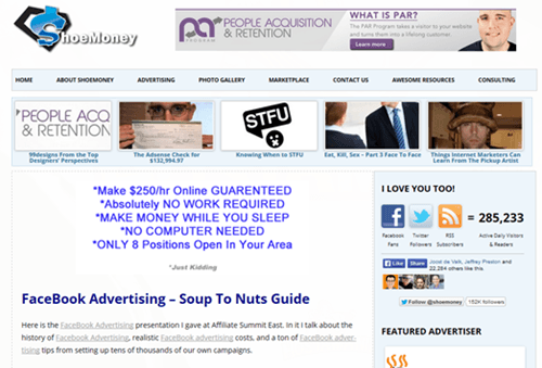
Don’t believe me or not sure what ads to remove? Test it – using an A/B testing tool try removing your most annoying or prominent ads for a week and see the impact on bounce rate and converting more visitors into subscribers or leads. You will be pleasantly surprised…
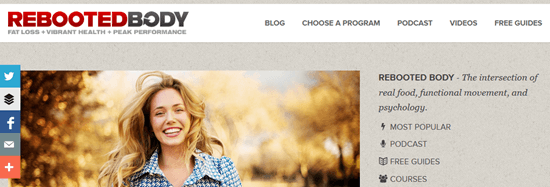
2. No value proposition clearly mentioned. So many blog creators expect visitors to know what their blog is about and the benefits of it, but neglect to actually clearly mention it. Why make your visitor have to work to understand? This is particularly problematic when visitors will often judge a website within just 10 seconds, and is a major cause of high-bounce rates on blog articles.
To make it easier for them to understand the benefits of your blog and increase the chances of them sticking around, add a few essential things to it – firstly add a tagline under your logo that helps visitors understand what the blog is all about. Secondly, add a small module towards the top of your side bar showing key benefits of your blog. You can see good examples of this on my blog, and on the Rebootedbody.com blog:
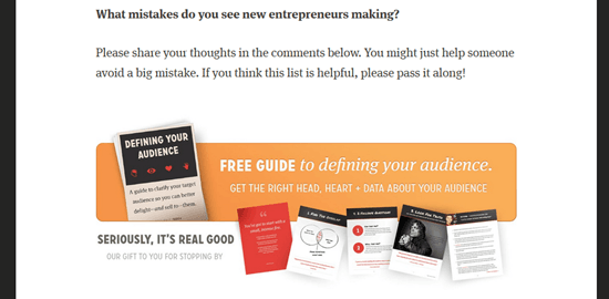
3. Dead-end articles with no good call-to-action. The end of articles is one of the most critical places on blogs – this is where your visitor’s eye flow ends up after reading your article. Unfortunately, many blogs don’t take full advantage of this space, and simply put related links at the end of their article – hoping that something will be of interest to their visitors. But this often just delays them inevitably leaving without subscribing or converting.
To capture hundreds more emails and boost your list growth, you need to use this space to show your visitors something of value for free (known as a lead magnet). This can be something like a related free ebook, a free trial to what you sell, or a free consultation. Make sure it stands out too, and include some imagery, otherwise your visitors won’t really notice it. Testing this is key for maximizing opt-ins, particularly the wording and call-to-action. See below for a good example of this on the Sparkline.com blog:
4: A non-mobile optimized blog. The percentage of visitors arriving on blogs via their mobile phone is growing at a crazy rate (it’s now over 20% on my blog) – and unfortunately many blogs don’t make it easy for these visitors to read their content. This is because reading blog articles is hard on small screens – unless you have a mobile optimized blog, visitors have to zoom and scroll to read your content. They will often get annoyed by this and leave your blog to find a related one that is mobile optimized.
To fix this, the best solution is to have a responsive website design that changes font sizes, images, layout and widths dynamically depending on the size of the visitors screen – this ensures your blog reads and looks great on any mobile device, including tablets. For a cheaper quicker option, consider using a tool that automatically mobile optimizes your blog like WP Touch. Below you can see a few fantastic examples of responsive blogs – the IWillTeachYoutoBeRich.com blog and the SmartPassiveIncome.com blog.
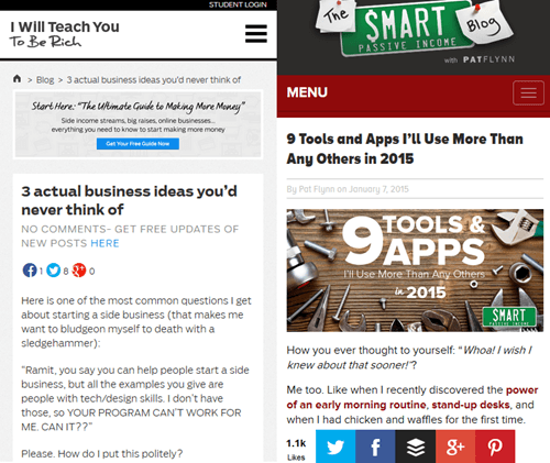
5. Short articles with no images or subheaders. This is a real visitor engagement killer – arriving at a blog that has no images and has just several long blocks of text. Unfortunately its still much too common, particularly for corporate website blogs. These types of articles make your visitors leave even quicker – probably unlikely to return.
To make sure your blog isn’t guilty of this, always try to write more in-depth content with images and subheaders – this not only makes your content seem much more appealing, but also makes it much more ‘scanable’. This will reduce your blog article bounce rates and increase the chances of your visitors finding your content valuable and subscribing/converting. As a bonus, longer content often results in higher rankings in Google.
6: A cluttered side bar. Now this happens all the time – bloggers just making their side bar a dumping ground for all kinds of promos, ads and widgets and hoping visitors will like at least one thing. Often continually adding new promos, without removing older ones. But in reality, the more content you have in your side bar, the greater chance your visitors won’t see any of your really good content there. And worst still, having ads there cause ‘banner blindness’ so your visitors will often just ignore the whole side bar.
To fix this, remove less useful content from your side bar – for example, in addition to ads, blog categories are not really that helpful and take up a lot of room, as do latest Tweets or Facebook widgets. Instead focus it on promos for your most useful content and value proposition. If you aren’t sure what to remove, really think what is most useful, and test removing different content using an A/B testing tool and check then impact on conversions and bounce rate.
Maximize your leads or email list by downloading this free content upgrade – my 20-point blog conversion optimization checklist. Grab my blog optimization checklist (PDF)
7: Few signs of social proof. Unfortunately many blogs look like a ghost-town with little signs of good social proof, even ones with good traffic – with few comments or shares, no mentions of popularity or how many subscribers or followers they have. Just like people prefer restaurants with good reviews and many diners in it, blog visitors are much more likely to think positively and subscribe to blog content that they know other people love and often use.
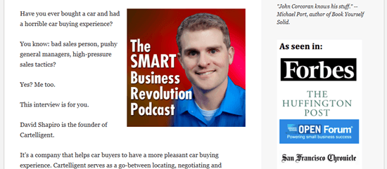
There are many ways to increase social proof on your blog. First, if you have a good amount of readers or followers (ideally over 1,000), then clearly state that in your side bar. Second, if you have great reviews, place a testimonial there too. Showing well-known media mentions will also help boost social proof – like you can see on the SmartBusinessRevolution.com blog:
Don’t forget to also add social media icons that include share numbers (but to avoid negative social proof, only show numbers when they are higher than 20) – add this at the end of your articles, or make them sticky to the left side. This is a simple way to increase signs of popular and social proof.
8: Bland, non-engaging article headlines. It doesn’t matter how good your blog articles are if your headlines are dull and not captivating – few visitors will stick around to read it, let alone convert into a subscriber or a lead. Sadly, many blogs make this mistake and are in need of some good copy-writing love. Many blogs also use small headline fonts, which makes them even less attention-grabbing.
To fix this, always use compelling copy-writing principles for your article headlines and make them stand out. Using steps or numbers, asking questions and mentioning common visitor pain points are some good ways to make your headlines more engaging – here is a great guide for creating captivating blog headlines. You should also check out this great headline testing tool to find highest-clicked variations of your headlines.
9: No good incentive for visitors to subscribe. So many blogs just mention ‘subscribe to our blog’ or ‘get updates’ in their side bar and hope thats good enough to convince visitors to do so. Bad news folks – if you do that, you won’t be getting many subscribers – it’s not very compelling or even eye-catching, and offers little value proposition to your visitors. When was the last time you actually subscribed to a blog that way? Your visitors rarely will either.
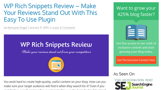
To increase subscribers and build your email list quicker, give your subscriber box an upgrade – create a compelling free incentive to subscribe and mention it in your sidebar with visuals to help draw your visitor’s eye. For example, create a free short mini-course or a giveaway a short ebook relating to your blog. Again, A/B testing is key here to ensure highest conversion rates. Here is a great example of an ‘upgraded’ subscribe in the side bar on BloggingWizard.com (with excellent enticing copy):
You could also try using a ‘content upgrade’ call-to-action in your article, like I use to giveaway my conversion rate optimization blog checklist earlier and at the end of this article.
10: Outdated or ugly blog design. Visitors will judge your blog very quickly – particularly by how good it looks. A well-styled modern blog can really help engage your visitors and increase the chances of them subscribing/converting. If your blog looks like it was created with a free theme with little customization, your visitors will probably notice and not be impressed. Same applies if it looks outdated.
To fix this, consider a style face lift for your blog, and make sure its using latest popular widgets like a good comment system and social share options. To get some great inspiration use a service like 99designs.com to get designers to come up with a new modern look. Ultimately, it’s key to make sure your blog looks better than your competitor’s blogs, otherwise visitors will often prefer going there instead.
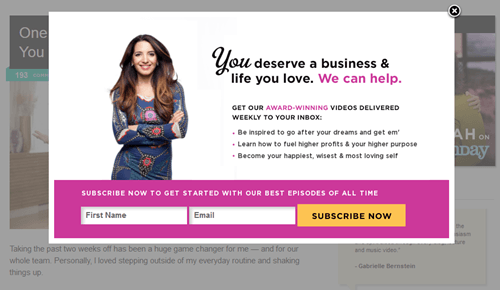
11: No use of exit popups to capture emails. One of the newest most effective ways to capture emails on your blog is to use a well-designed popup offering a free incentive, just before your visitors go to leave. This is known as an exit-intent popup. Interestingly, many blog owners think that popups increase bounce rates and annoy visitors – but studies have shown if used well using exit-intent, they don’t impact it negatively. And when I used the exit-intent popup functionality in Opt-in Monster to promote my free toolbox, I increased my email capture rate to 42%. Pretty impressive right?
There are plenty of options for creating customizable exit-intent popups – you can use SumoMe, Opt-in Monster or Popup Domination to name but a few. Remember to optimize what you are offering in your popup – don’t just just say subscribe, give them a great incentive like mentioned earlier. And test the wording, imagery and call-to-action button too! Make sure they can easily close it aswell. Here is a great example of a good eye catching popup on the MarieForleo.com blog:
12: No ‘start here’ page to help guide visitors. You have probably created some great articles on your blog – but unfortunately on many blogs it’s hard for visitors to know and find the best content. Most blog readers will only read your article they arrived on – and rarely take time to go through your old content to find other great articles – that may convert visitors better into a lead or subscriber.
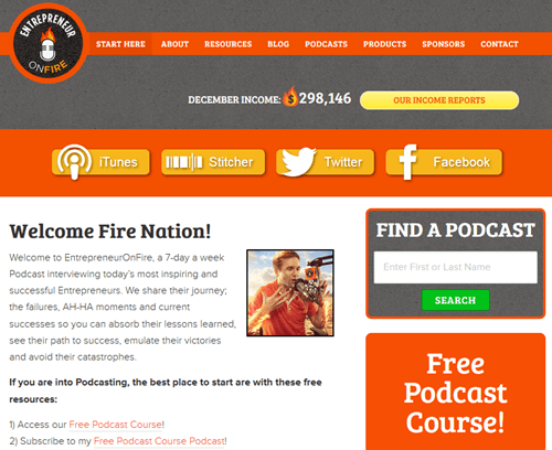
To increase the chances of visitors finding your best content and converting, create a ‘start here’ page and put a link to it in your main navigation menu (like on my blog). On this page include links to your most useful and popular content. Here you should also explain more about you, and why you created the blog – a good engaging story will really help! You can see a best-practice example of a ‘start here’ page on the popular EntrepreneurOnFire.com blog:
Wrapping up
To grow your email list and leads, it’s essential you give your blog some conversion rate optimization love mentioned in this article – in particular do some A/B testing on key elements like your headlines, call-to-actions and what you show in your side bar. Which of these techniques discussed are you using, or planning on using on your blog?
Quickly boost your blog leads or email list by grabbing my bonus free blog conversion optimization checklist. Download my blog conversion checklist (PDF)
And if you are looking for some personal help, I can quickly help optimize your blog to increase leads and grow your email list. I’m actually just about to help SEMrush.com with my conversion review service. Thanks!


