12 Simple A/B Tests You Should Be Running Right Now to Increase Sales or Leads
Last updated |
Fairly new at using conversion rate optimization (CRO) to boost your website sales or leads? Not really done much A/B testing? Not sure where to start?
To help you get a great kick-start with your efforts, I have created a list of 12 simple A/B tests you should use to increase website sales or leads. They don’t require much website coding or development to get up and running, yet have high potential impact. All you need is an A/B testing tool and to create 2-3 test variations to find which convert your visitors best into more sales or leads.
Let’s get started with the 12 simple yet high-impact A/B testing ideas..
- Emphasize your unique value proposition in your homepage headline
A common basic mistake websites often make is they fail to clearly and prominently explain their unique value proposition (why someone should use their website instead of a competitors). To remedy this, test using a few different headlines on your homepage to explain – ideally it should be under 10 words and try testing variations that ask visitors great questions to spike curiosity or clearly explain benefits. Here are a few good examples plus an indepth guide:

- Add some short powerful testimonials on your homepage
Using testimonials is one of the best ways to build social proof on your website and increase conversions. To test this great potential impact, gather 2-3 short and sweet testimonials from your customers, and add them above the page-fold on your homepage, ideally with an image of the person giving the testimonial to make it more eye-catching and believable. Testing embedding Tweet-based testimonials is a great eye-catching way to show short testimonials. - Add a free incentive and capture email leads via a popup
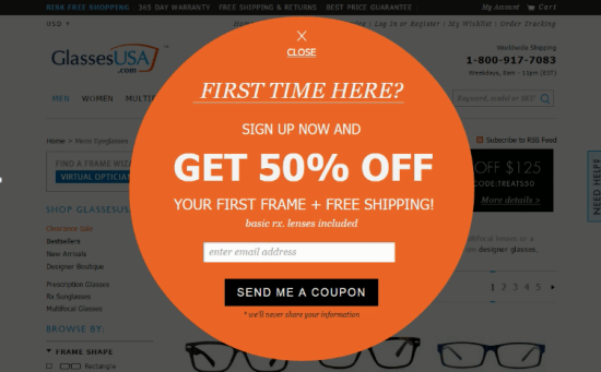
Don’t just rely on your website converting your visitors first time they arrive. Instead, create a great free incentive (like a short related ebook, free consultation or first time visitor coupons) and then use a lead capture pop-up tool to promote it and get your visitors email in exchange. Then you can send a great series of engaging auto-responder emails (using a tool like Aweber) to your visitors to increase the chances of them coming back and converting.
- Show media mentions on your homepage to boost social proof
Another great way to build social proof is to test showing media mentions that your website has received, for example any reviews or mentions on leading websites, newspapers or TV stations. Showing these quite high up on your homepage will make your website seem much more popular and help to increase leads or sales. - Make your call-to-action buttons more actionable
No A/B test list is complete without a test to improve your call-to-action buttons – these have a huge impact on conversion rates. Don’t just test the size, color and location of your buttons, you should also test making the wording on them much more actionable and enticing. Test using action based words to get higher engagement – don’t use boring and dull words like ‘Learn more’, ‘Download’ or ‘Submit’. Here are a few great examples:

- Remove clutter from your homepage to increase clarity
One of the most common problems I’ve seen with many websites are cluttered homepages. These often overwhelm visitors with choices (the paradox of choice), and lack focus on solving for visitor’s main needs. To focus your homepage much better and increase click-throughs, simply set up a test removing 3-5 of your less important modules on your homepage like your latest news or big call-to-action buttons for old or less important content. - Add risk reducers in header or side bar to increase their visibility
To increase the chances of visitors purchasing from you, you need to reduce their risk of purchase by offering things like guarantees, free trials or free shipping or returns. To increase the chances of visitors seeing these and being influenced by them, you should test adding some risk reducers like those to your header or sidebar – this ensures that they are seen no matter what page your visitor arrives on (not just your homepage).
- Improve your navigation menu to entice visitors
Another great simple test is to improve your navigation menus so they are much more compelling for your visitors and act as funnels to your most important pages. In particular test using more compelling link names instead of generic unexciting ones, for example ‘Happy customers’, ‘New? Start here’ or ‘Why use us?’ links. And if you have multiple sub-categories test using drop down mega-menus to make the contents of them more visual and enticing. - Add security seals to your checkout or signup pages
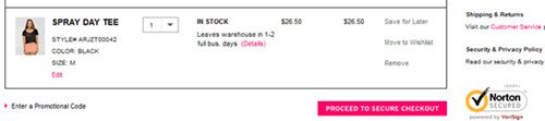
It doesn’t matter how good the rest of your site is if your visitors don’t get a sense of trust and safety in your shopping cart or signup flow. Therefore to reduce purchase worries when they will be highest, you should test clearly adding security logos and text (100% safe and secure) on those pages – not just in your footer. Don’t over do it though – one good security seal like Verisign or McAfee will usually be enough to increase sales.
- Cut out the fluff in your side bar and focus on solving needs
Sidebars on websites can be just as bad and cluttered as homepages for confusing your visitors. Test dramatically simplifying them, for example removing your latest Tweets module, Facebook fan modules or those ads that probably don’t make you much money. Ideally you should only have your 3-4 most important modules in your side bar that help solve your visitors main needs and relate to your key website goals. - Add business accreditation seals to your footer
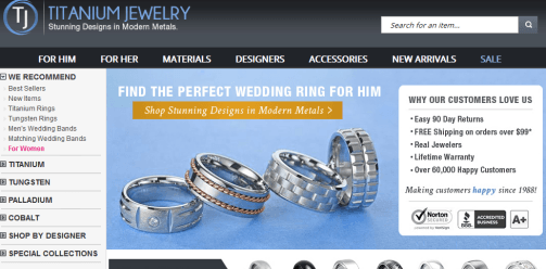
To help build more of a sense of trust for your visitors, you should also test adding in some business accreditation seals in your website footer. BBB seals are the best example of this, but also try using things like logos of associations that your online business is a member of. - Add a ‘why use us’ module to explain unique value proposition
Going back to unique value proposition – I can’t emphasis enough how important this is, especially to your first time visitors. To increase the chances of your visitors understanding reasons to use your website instead of your competition (and decrease your bounce rate), you should test adding a ‘why use us’ or ‘why our clients love us’ module on your homepage with 3-4 short bullet points to help explain this. Don’t just presume your visitors know!
And for those of you looking for more A/B testing help, I have some great articles – help for picking an A/B testing tool, and help if you aren’t sure you have enough traffic to do A/B testing.
Wrapping Up
Which of these 12 simple A/B tests have you used so far? What other simple A/B tests have worked best for increasing leads or sales? Please comment below so we can discuss.