How to Create Highly Converting Navigation Menus Your Visitors Will Love
Last updated |
When was the last time you improved your site’s main navigation? You may have created it quickly without much after thought of how your visitors might engage with it. It can actually have a tremendous impact on visitors perception of your website, whether they can easily find what they are looking for, and ultimately whether they purchase what you are selling.
Even in 2014, I am still amazed by how many poorly designed, visitor repelling website navigations I see. It’s one of the things that I always get my clients to focus on improving, so thought I would share some menu optimization best practices. This varies depending on what type of website you have…. so let’s get started!
Optimizing Lead Gen/Service Website and Blog Menus
Follow these navigation menu optimization steps if you have a website that’s main goal is to generate leads or sell a limited number of products/services.
Step 1: Step back and examine your visitor’s most important tasks and needs
First of all, it’s essential to take a step back and consider your visitor’s needs and most common tasks they will want/need to achieve from your menu.
If you don’t do this, you’ll risk visitors not being very engaged or finding what they want (and leaving). So go ahead and create a list of at least 20 visitor tasks, and then figure out the top 5 or 6 most common. This will form a great starting point for your menu.
Examples of key tasks: schedule a demo, understand who you are, get an overview of your service features, get support, or get details on your guarantee.
Step 2: Add menu links emphasizing unique value proposition and benefit
Now you have your essential tasks from step 1, it’s essential you add items (and related pages) to your menu that help visitors discover your websites unique value proposition and benefits. This is because if they don’t truly understand this, your chances of engaging and converting them will be much lower.
For your inspiration, here are some excellent types of short menu links to add that help convey your websites’ unique value proposition and benefits:
- ‘Why Use Us?’ or ‘Why (insert company name)?’
- ‘Benefits’ or ‘Why You’ll Love Us’
- ‘New Here?’ or ‘Start Here’
- ‘How It Works’ or ‘How We Help’
Don’t forget to test the wording you use too – A/B test different variations until you find the version that gets highest click through rates. We will cover testing in more detail at the end of this article too.
As a great example of this, Carnival.com do an amazing job with building value proposition in their sub-menus, including great supporting visual icons:

Step 3: Add links for building social proof and credibility
Building social proof and credibility are essential ways to help engage visitors and increase conversions. Therefore, your menu should also include items that will help with this, and it also ensures visitors can see them from any page they arrive on.
- Add links relating to testimonials or reviews. If you have clients or users, then have a link item with ‘Happy clients’ or other intriguing wording (rather than just using plain old boring ‘testimonials’ wording).
- While its important you have a case studies link to build credibility and social proof, try using more exciting wording like ‘success stories’.
- If you have lots of great press mentions to build credbility, don’t just use the link name of ‘press’ in your menus – use better wording like ‘Media Mentions’ or ‘In the News’.
Step 4: Trim off less important links in your menu and stick to under 5 or 6
Now that you’ve added links relating to unique value proposition, credibility and social proof, its time to trim out the fat from your menu.
- Cut out the less important links from your navigation and keep it to under 6 links. If you aren’t sure what to take off, run a click map to find the top clicks on your homepage navigation (use Google Analytics inpage tracking, or a tool like CrazyEgg to find this).
- Put less important links in the footer. For example, if you already have more important links, move your ‘Contact us’ or ‘Blog’ links to your footer. And unless your product requires a high amount of support, move ‘support’ links into the footer too.
- If you want to get smart and really engage your visitors much more, you can use an A/B testing tool to show two versions. One version for new visitors (aimed at converting them into clients) and a version for current customers – detected by visitors logging in – that shows account and support related options.
Step: 5: Optimize the wording of your navigation items to better engage
Forget about what your navigation menu looks like for a minute. Its the words in them that count much more. The worlds best looking navigation menus often have bland, non-engaging, or plain confusing links that will turn visitors away in droves. Here are some tips to remedy this:
- Use wording that excites your visitors to click and learn more – action based wording works well (like ‘Get’, ‘Learn’ or ‘Try’). Always try and avoid boring words like ‘Products’, or ‘FAQs’- get creative. But don’t be too cryptic or too clever either, as this will confuse visitors.
- Use wording that speaks your visitors language and their likely needs – don’t ‘we we’ on your visitors by mentioning ‘our’ too much!
- Instead of using just a boring ‘About Us’ link name, use more intriguing language like ‘Who is X’ or ‘Why X?’
- Cut out corporate speak or jargon – dumb it down – don’t confuse your visitors and make them have to think too much!
Step 6: Make it stand out and look like a navigation menu
On the other hand, you may have great menu link wording that engages and converts your visitors, but if your menu is too small, blends in or gets drowned out, then your efforts will be wasted, as it won’t be seen or interacted with well. Here are some tips to make sure its seen:
- Make it really look like a menu, not just a set of links! Use some style to do so – for example tabs or a background to make it stand out.
- Unless you are a web design agency, don’t make it too cool or hard to use. Never make visitors guess as to what is navigation, or use mystery meat navigation options – they might seem cool to your designer, but they are probably really annoying your visitors.
- Make the font size large enough to be noticed easily (but not too big to drown out headlines or call-to-action buttons) and a clear font face.
Good examples of navigation menus with best practices:

Why its good: Customer orientated, benefits driven menu links, with good usage of drop down menu to show more.

Why its good: A really user driven, benefit focused menu, even includes a useful competitor comparison option.
Examples of poorly designed non-engaging menus:

Why its poor: Generic, sales focused links (with ‘updates’ and ‘contact’ of no real value), with no focus on benefits.

Why its poor: Contains confusing, non-traditional links – applications, references, and academy make it sound educational.
Optimizing Ecommerce Website Menus:
If you have an ecommerce website selling many items, your visitors have different navigation needs, so you need to follow slightly different steps to ensure they are engaged, and quickly find what they want and purchase:
Step 1: Figure out your visitor’s most important categories
Rather than just including every single category or sub category in your menu, and potentially overwhelming your visitors, you need to take a step back and determine the most important ones for visitors needs. Create a list of all of your categories and subcategories. Then trim this down to less than 10 of the most important, common categories. This is a great starting point.
Step: 2: Trim your choice of categories and menu options
If you are using more than 10 categories in your navigation, you will run the risk of confusing your visitors (paradox of choice) and them leaving prematurely. So time for trimming the fat!
- Cut out the less important links from your navigation. If you aren’t sure what to take off, run a click map to find the top clicks on your homepage navigation (to find this use Google Analytics inpage tracking, or a tool like CrazyEgg).
- If you have account and help links in your main navigation, move them into a mini-navigation in top right instead (this is an industry standard place).
Step: 3: Optimize your choice of other non-category options
It’s not all about trimming though – to further optimize your menu, consider adding some of these types of useful links to make it more user friendly and increase the chances of purchase:
- Make sure you feature a ‘sales’, ‘specials’ or ‘clearance’ menu link to cater to the many bargain hunters online and increase your sales.
- Make room for a ‘Why Shop With Us?’ link towards the right. Just because you are an ecommerce website, and you think its obvious what your benefits are and what you sell, doesn’t mean your visitors will know for sure. Adding this in navigation ensures it gets more visibility too.
- If you don’t have many major categories, create categories with other definitions – for example by most popular, by brand, by type of user/type of usage. Your visitors will thank you for adding those important browsing options.
Step 4: Optimize your style of menu and test mega-menus
- Don’t reinvent the wheel – have a top navigation menu – you aren’t Amazon! By all means, test switching to a left-hand main navigation, but it has to be very good – they are often fraught with usability issues, particularly ones with many levels of sideways expanding menus. Instead, its better to use a side bar to compliment your header navigation (and show filter and sort options).
- For your drop-down menu subcategories, don’t just have text links for all your subcategories (this will overwhelm your visitors). Instead, include other ways of grouping links, like brands, most popular or newest items, and trim off any rarely used subcategories too.
- Don’t just have a bland text heavy drop-down menu – test some variations that include visual items or icons, mega-menu style. Research has shown these mega-menus work well for improving navigation.
Good examples of ecommerce navigation menus:

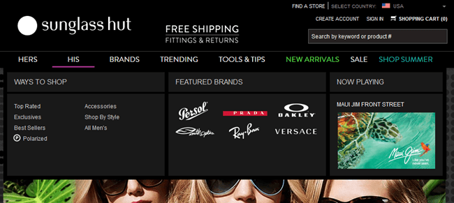
Why its good: Well organized by very useful categories, and nice simple mega-menu with simple subcategories, engaging visuals and brand logos.

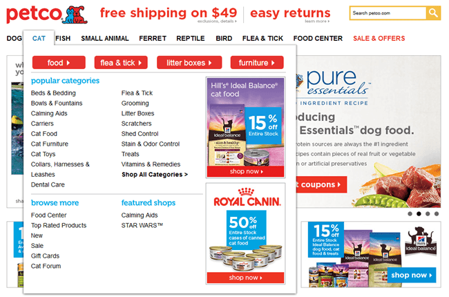
Why its good: Great use of mega-menu, with 4 most common subcategories highlighted in red at the top of each subcategory, and good related sales images.
Examples of poorly designed ecommerce navigation menus:

Why its poor: Non-obvious menu with very small text links, overpowered by banner below (and what are ‘misses’?)

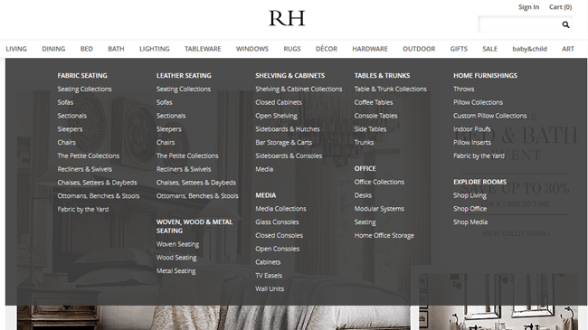
Why its poor: A ridiculous amount of categories, and links in mega-menu. The definition of paradox of choice!
Test, Test, Test! Don’t Presume Your Menu is Good Enough
And lastly, for any kind of website, it’s essential you test and tweak your menus to make sure you find the variation that gets the highest click through rates and sales.
In addition to the steps above, here are some other things to test optimizing on your navigation menu:
- Test changing how you sort your sub-menu contents. Instead of just sorting by alphabet, test putting your most important content first instead.
- Test showing related small icons for each navigation link. This can work well, but depends on style and what you are selling.
- You don’t have to use an A/B testing tool – get visitor feedback! Rather than create fully working navigation menus to test, create mockups of them and get some results from UserTesting.com. Ask which versions compel testers the most, and what they would improve.
Wrapping Up
So there we have some great steps for optimizing most kinds of website navigations. Which have you tried using? What has worked best for improving your engagement and sales? Feel free to share any of your favorite navigation menus.
And do you need help improving your own website navigation menu so it engages and converts many more visitors? I’m here to help improve your menu and website with my website review services!


