User-Focused A/B Testing For Improving Your Website Conversion Rate
Last updated |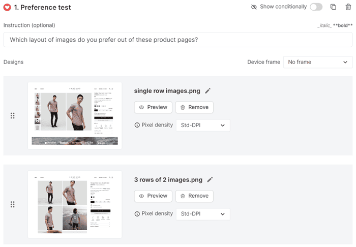
There are three major problems with A/B testing for improving websites:
- It doesn’t tell you why your visitors preferred the winning version. It only tells you which version won (if any).
- It doesn’t give you any feedback from visitors about the improvements you were A/B testing.
- The majority of websites don’t even have enough traffic for doing A/B testing, or only for key pages.
So I decided to create a new technique to help solve these problems.
It’s called User-Focused A/B Testing, and it helps you discover ‘why’ users prefer different page versions, not just ‘what’ they prefer. And it doesn’t require lots of traffic like traditional A/B testing does.
And more importantly, it gives you great feedback and insights for creating high-impact website improvements, meaning a much better chance of increasing your website conversion rate and revenue.
So let’s get started with learning the 7 steps of User-Focused A/B Testing.
1: Create a variation of the page you want to improve
First you need to create the variation of the page that you want to improve. You may already have some ideas of what you want to improve, but ideally the improvements should come from insights gathered from doing conversion research (web analytics, expert reviews, user testing, visitor recordings, and surveys), as this ensures much better results on improving conversion rates and sales.
2: Do a ‘preference test’ with 100 users
The ‘preference test’ at UsabilityHub is a great alternative to traditional A/B testing, and it allows you to gather feedback from your target audience on which version they prefer and most importantly, why they prefer it. And you don’t need any website traffic to do this.
To create a ‘preference test’ simply take a screenshot of both pages and upload them to the tool, add a question that asks which page version (or page element) they prefer, and then add a follow-up question asking for the reasons why. This can be for a whole page, or for a specific thing like a headline.
To give you enough responses to analyze and gain insights from, I suggest testing 100 users. You will need 200 credits for this, which costs $200.
It will be one of the best $200 you will ever spend for learning about your website user’s preferences! To make sure the users match your target audience, you need to also set the demographics that you want them to be. You can target by age, gender, country, household income, education status, employment status, and even B2B demographics like job title and industry. You can also recruit your own users by sharing a link to your preference test, which you could do either via email to your customers or by showing it to your website visitors in a pop-up. You can also do something similar with another tool called Maze. You simply create a survey that includes an image of both versions, and then use their panel to ask them which version they prefer, and why they prefer it. Next you need to launch both versions of your page for a short time so that you can watch recordings of your visitors interacting with both of them to see if there are any differences in how they use them. To do this, you will need to use an A/B testing tool to do a split test, so 50% of users will see each version. It doesn’t matter that you won’t have enough traffic to get an A/B test result, you are just using it as a tool to launch both versions at the same time. Then use Hotjar or Microsoft Clarity to do the visitor recording of both page versions. To give you enough insights, you will need to watch at least 100 recordings of each page. To find recordings of those pages, you can just set up a filter in the tool to match the URL of them both. In the recordings, look for variances of where they are moving their mouse, where they seem to be hovering over more, what they click on, and what they seem to ignore. Also look for any elements of each page they seem to have difficulties using, as the new page should try to improve on this. This short survey enables you to gather insights from people who are currently using your website — who are essential users to gain feedback from. I suggest using Hotjar or Survicate to create this survey and pop-up an invitation to start it (don’t show it too soon after visitors arrive though, as it will often annoy them, so I suggest after a minute). In the survey, show them both page versions and ask them the following questions in particular: You also need to ask questions relating to exactly what you have improved. You should get at least 50 responses to analyze, and to increase your response rate, offer a chance to win a gift certificate or discount as an incentive. User testing helps you gain in-depth qualitative feedback from visitors about your new page variation, and is delivered in the form of a screen recording of them using your website and audio of them answering your questions. Use a tool like Userfeel to set up a user test with 5 users that match your target audience — it’s important to add screener questions for this, e.g. the users should be familiar with what you are offering or have purchased previously. When creating the user test, you need to add a task for them to compare the two pages, and then ask them the following questions to get better insights: Then to get even more insights and maximize the feedback time you get, add some questions that relate to the elements that you are improving, for example, what do you think of the imagery or product filters on both versions. With any time remaining, you can then get the user tester to give feedback on your whole website. If you don’t have that much budget for 5 user tests you can skip this step, or only do it for your most important improvements. Next you need to spend time reviewing the results to see which page version your users seem to prefer, and the reasons why. To help you determine the winning page version, you should create a simple document that highlights the positives and negatives for each page. This analysis will also give you great insights and ideas for improving the winning page even further, like improve usability or clarity on the page. And if users often said they didn’t notice the difference between the two pages, you should make the improvement more prominent. If the new page doesn’t get very good feedback, you need to gather more conversion research (web analytics, expert reviews, user testing, visitor recordings, and surveys) to create better improvement ideas for it, and then do another round of User-Focused A/B Testing. You should feel confident now that you have discovered which page your users like better — hopefully the improved page you created. If users it to the current page, you need to launch it. To ensure the improved page does have a good impact, you need to monitor the impact of it on your conversion rate and revenue in Google Analytics over the next few weeks, and compare it to the previous weeks and the same period last year. If you are lucky enough to have enough traffic (at least 5,000 visitors per week to the page you want to test), ideally you should run an A/B test on this winning page to determine that it has a positive impact on your conversion rate and revenue. Don’t just stop after you have done this for one of your pages. To get the best results from this, do this User-Focused A/B Testing on each of your key pages to improve them too, particularly your homepage, product pages, and your checkout or signup flow. Go ahead and try this for your next website improvement. I’m sure you will love the great results you will quickly get on your conversion rate and revenue.
I’ve partnered with UsabilityHub to offer this exclusive deal for 20 free credits.
Claim these free credits on this page using the RICH-PAGE-20 credit code.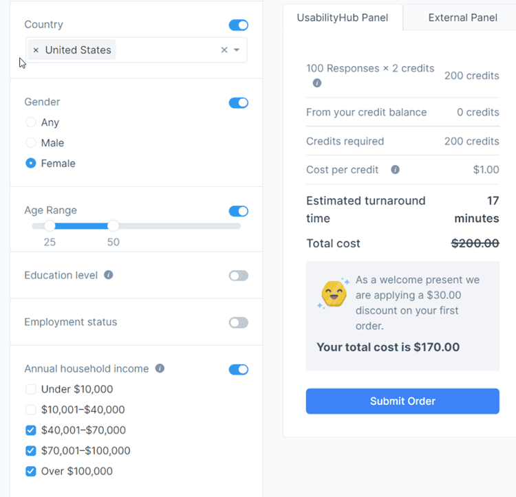
3: Record your visitors interacting with both versions
4: Set up a visitor survey to gain feedback on both versions
5: Create a user test with 5 users for your target audience
I have partnered with Userfeel to offer this exclusive deal for 10% off user tests.
Get 10% off by using the code 10FROMRICH at checkout6: Analyze the insights and declare a winning version
7: Launch the winning version and monitor impact
Do this User-Focused A/B Testing on all of your key pages