Ecommerce CRO: Everything You Need To Know To Increase Conversion Rates
Driving more traffic to your ecommerce website is just one essential part of running a successful online business. The next step is a bit more challenging—converting your website users into paying customers.
There are many elements that can make or break your ecommerce conversion rate. Luckily, there are a number of things you can do to improve it using conversion rate optimization (CRO).
We’ll take a closer look at why CRO is so important for ecommerce businesses, as well as expert tips and ecommerce CRO reviews to help improve your website’s conversion rates.
What Is Ecommerce CRO and Why Is It So Important?
Ecommerce conversion rate optimization is the art of improving your website to convert more visitors into customers and increase your revenue, by optimizing your homepage, category pages, product pages, cart, and checkout, and elements like your navigation and search.
Here are the main benefits of ecommerce CRO:
- Increases the usability of your ecommerce website so more users purchase.
- Generates many more ecommerce sales on your website using existing traffic.
- Maximizes your marketing spend ROI and lowers the cost of acquisition.
A good conversion rate for ecommerce stores is 2%, and if you are doing very well with CRO that could get to 4% or more. But that depends on what type of products you are selling, how expensive they are, and who your target audience is.
If your conversion rate is lower than 2%, you will have great potential to increase this by doing CRO.
Expert Tips to Increase Ecommerce Sales With CRO
I have helped many ecommerce businesses increase their conversion rate and revenue over the last 15 years. Here are some expert tips to help you get started with your ecommerce CRO efforts.
Clearly display your UVP on entry pages
Your UVP (unique value proposition) outlines why your website visitors should buy from your website instead of competitors.
Many ecommerce stores don’t explain this well, meaning that their visitors may go to a competitor website that explains their UVP better.
The biggest problem is actually hiding it away on your website — don’t presume your visitors know your UVP! That is why it’s essential to show your UVP on your entry pages to ensure visitors always see it, no matter what page they arrive on.
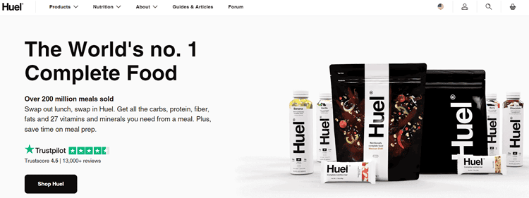
One of the best ways to do this is by adding a UVP bar below your navigation menu with some key benefits/risk reducers, with engaging icons. Huel.com do this very well.
Always mention your UVP on your homepage above the page fold, either in the form of a headline or bullet points with icons. Huel.com do this well.
Don’t forget to promote UVP in your Google Ads and Facebook Ads too, as that will increase click-through rates, and improve message continuation.
And lastly, don’t be satisfied with your current UVP. You should always try to improve it to beat your competitors, for example by offering a 110% price match guarantee or a longer warranty.
Improve your category page and search results filters
Category pages and search results are very important for visitors to help them browse, particularly if they don’t know exactly what they want.
Having poor filters on your ecommerce platform often means that visitors have to scroll through hundreds of products which contributes to paradox of choice and much higher exit rates.
That is why it’s essential to improve your filters on category pages and search results so visitors can easily drill down and find exactly what they need.
This is what you need to do to optimize your filters:
- Don’t hide them away — make them always present in your sidebar or at the top
- Make them sticky at the top on mobile devices, so they can be used at any time
- Ensure you can choose multiple filters at the same time
- Check that your filters are easy to select and deselect, particularly on mobile
- Add more filter types — not just brand, price and colour, but also use types, etc.
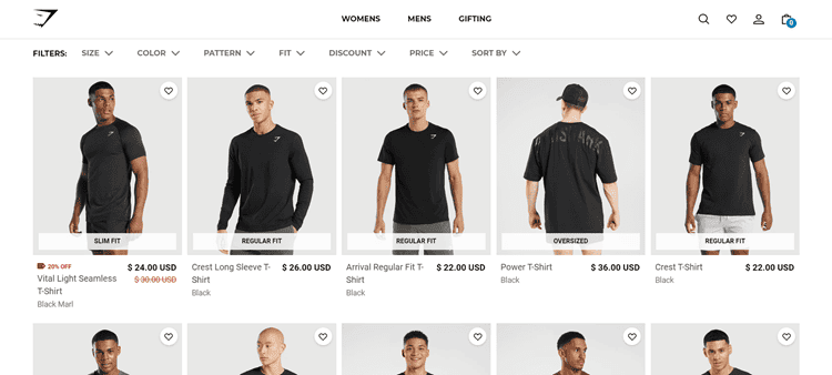
GymShark.com do this well and have great sticky filters at the top of their category pages.
Promote your shipping and returns incentives
Not only does free or low-cost shipping really help increase your ecommerce conversion rates, but many of your competitors are offering it.
And now many smarter ecommerce stores are also offering free returns to make it easier for visitors to try products with lower risk.
But don’t just improve your shipping and returns incentives. You need to make them much more prominent – many ecommerce stores make the mistake of hiding their shipping and returns promotions or not making them clear enough.
Therefore this is what you need to do as soon as possible:
- Promote them better by showing near your add-to-cart buttons, on your homepage and in your UVP bar below the navigation. This ensures they get noticed.
- Simplify long and confusing shipping and returns policy pages.
- Always include links for shipping and returns in the footer.
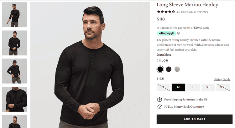
UnboundMerino.com do this very well by promoting their free shipping and returns, and money-back guarantee, right by their add-to-cart CTA.
Improve your product imagery and add videos
It’s obviously essential to show photos of your products. But the bar for quality and number of product photos on product pages is now very high on ecommerce websites.
If you only have 1 or 2 pictures, or they are low quality, you will lose ecommerce sales to competitors with more or better ones.
That is why its essential you do this to improve your ussage of product images and videos:
- Get more high-quality images of your most popular products — at least 3 per product, and include photos of them being used or worn.
- Increase the quality and resolution of your images, which also means your zoom will work better. I also recommend getting 360° photos created so visitors can see your product from any angle.
- Create short videos of your most popular products — a video is worth 1000 photos! These should be under 1 minute and highlight your product being used and the features and benefits of it.
- Get your customers to include photos with their reviews. To get this quicker you should email your customers and give anyone a gift certificate that submits a photo.
- Ensure your image carousel works well on mobile, including swiping. This is very important with such a high percentage of users now on mobile.
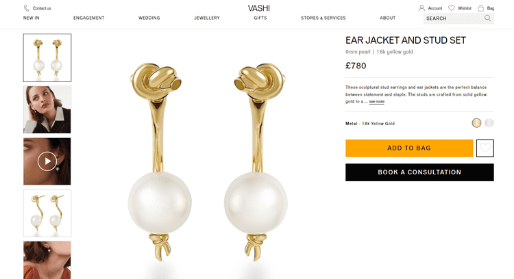
Vashi.com does a particularly well for showing many images from different angles and being worn by different people. They also include a video to show you what the product looks like in real life.
Fix your hidden website issues
It doesn’t matter how well you improve your website if hidden issues aren’t discovered and resolved.
And I’m not talking about 404 issues or broken links — its the less visible things impacting user experience that you may not have checked very well.
For example, a Shopify app could be breaking your filters on some devices or not showing correct search results. Or your cookie banners may be blocking CTA buttons.
Here are some of the other most common ecommerce hidden websites issues:
- Poor or not understandable field error validation in checkout
- Broken/squashed layout on smaller devices with 375 width
- Mega menus that cover important content and CTA buttons
- Layout broken on tablet due to stretched buttons or images that are too large
- Product page image gallery is not working properly on mobile
- Site search not working well or giving bad results
See more examples of hidden common website issues that you need to fix.
The best way to discover these hidden issues is by using a tool like BrowserStack.com to check your website in the most common browsers and devices, and do regular user testing with a tool like Userfeel.
Fixing these has a huge positive impact on the conversion rate and sales for your online store.
Examples of How to Improve Ecommerce Websites
Here is some examples of ecommerce CRO teardowns that are a single page version of my expert ecommerce CRO review. They will help you understand how to optimize product pages and category pages.
Product page CRO teardown for Huel
In this teardown, we find many elements on their product page that could be improved. This includes:
- Fixing the most common DTC issue about subscriptions.
- Increasing usage of customer images and user-generated content (UGC).
- The issues with their unconventional product page layout.
- Using sticky sub-navigation to improve user experience.
Category page review for Allbirds.com
Although the website has some good filter options, there are many ways the brand could improve their page. This includes:
- Improving filters and sort options.
- Showing their unique value proposition with content blocks.
- Adding lifestyle imagery when hovering over products.
- Making filters sticky on mobile so that they get used more.
Why Use Rich Page to Boost Ecommerce Sales With CRO?
- I have 15 years CRO experience and have increasied revenue for 100’s of ecommerce websites.


- You get high-impact CRO recommendations and A/B test ideas from just me, a seasoned expert. Not from a potential team of rookies or outsourced help at a CRO agency.
- I’m much lower cost than a CRO agency because I don’t include website design and development, just high-impact CRO recommendations that you launch with your team.
- I’m the author of two popular CRO books including ‘Website Optimization: An Hour a Day’.
Recent Examples of Ecommerce CRO Success For Clients
- 44% increase in conversion rate for UnboundMerino.com, and $216K in annualized revenue.
- 164% increase in conversion rate for ManlyBands.com, and $988K in annualized revenue.
- 19% increase in conversion rate for JosephJoseph.com, and £260K in annualized revenue.
- 66% increase in conversion rate for an online mattress retailer, and $2.6M in annualized revenue.
