The Most (and Least!) Important Elements that Impact Your Website Conversion Rate
Last updated |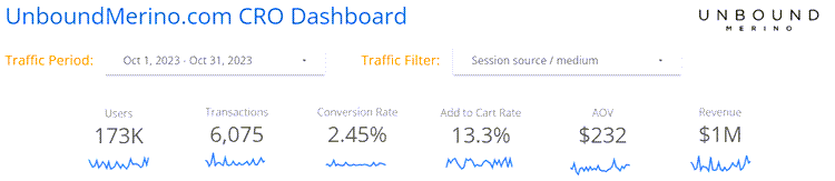
There are now 100’s of elements to consider when improving your ecommerce conversion rate and sales.
And it’s not just about A/B testing any more, there are many newer conversion rate optimization (CRO) techniques to use like persuasion and personalization.
So what actually works best for improving ecommerce conversion rates?
To help you understand this, I have created a list of what elements and techniques will likely have the most, and least, positive impact on your website conversion rate. And some of them you might be surprised at!
This list of elements is based on my learnings from 15 years experience improving 100’s of ecommerce websites, including ManlyBands.com, JosephJoseph.com, and UnboundMerino.com.
Let’s get started, with rankings from least important to most important:
Low importance on conversion rate
A/B testing the colour of your CTA buttons
Different CTA button colours will often only have a very limited impact on conversion rate, unless it matches other elements on your page and doesn’t stand out. Ideally they need to stand out from the rest of your page, but there are many other higher impact website elements to improve first.
Improving your webpage load times
A controversial one here, as this is often mentioned as important. The truth is that unless your pages are noticeably slow at loading (over 5 seconds) and you are in a very competitive market that visitors can easily go elsewhere to buy what you offer, then improving load times likely won’t have much impact on your conversion rates. I’ve experienced this with many clients.
Personalizing your website to improve engagement
This newer trend has many tools specializing in this. While this helps to show more relevant content to your visitors and can work well, you should only start personalization efforts after you have improved your website to a good CRO standard first. It doesn’t matter how much you personalize your website if it has poor usability and isn’t very engaging, it still won’t convert very well.
Improving things that your HiPPO wants
Your HiPPO (highest paid person’s opinion) may often want something changed or improved on the website based on their opinion or what they have seen on other websites. Listening to them rarely increases your conversion rate and revenue (unless they are a CRO expert) and is the opposite of creating good insights and A/B test ideas from doing conversion research to improve your website.
Medium importance on conversion rate
Improving your navigation menu, filtering and search
These elements are often one of the first things used on your website, so need to be highly usable. The better they are, the more likely that visitors will find what they are looking for faster and easier, and convert. It’s particularly important on mobile category pages to make your filters more prominent and easy to use, ideally using sticky elements so they are always visible.
Using website persuasion techniques like scarcity or urgency
This technique can sometimes work well to influence visitors to purchase or signup for something, for example having limited availability of what you offer or showing a time limited discount or sale. It all depends on what type of products you are selling and your exact target audience. Always test different ways of doing this though, as some types might not work well for your audience.
Improving your shopping cart and checkout
In particular you should improve it by reducing friction (remove header navigation for example), increasing the perception of security, and prominently showing risk reducers like guarantees, free shipping, and free returns. But don’t just focus on this — you need to optimize the whole visitor journey up to this point, including your homepage, category pages and product pages, or you won’t even get that many users to your checkout.
High importance on conversion rate
Prominently showing unique value proposition on key entry pages
It doesn’t matter how engaging your website is if you don’t clearly show your unique value proposition — the reasons that someone should purchase from your website instead of your competitors (low price guarantee, biggest selection, highest rated etc). And don’t presume that your visitors know it already, on the contrary, they will often be doing comparison shopping. Therefore you need to add key elements of your unique value proposition prominently on your key entry pages, like in a benefits bar under your navigation, and on your homepage.
Improving your mobile website further — not just responsive
Don’t just settle for a basic responsive website that changes the layout and sizes. You need to make more adaptations to meet their needs better, for example, making sure your links and CTA are easily clickable, that your fonts are big enough to ready easily (above size 14 font), and by using sticky navigation elements. You also need to check your layout doesn’t break or look squashed on smaller devices that have only 380 width.
Improving social proof to get more visitors buying
This should be done in many ways. The most essential one is to show many reviews (with customer images in them) on your product pages and include at least a few 1 or 2 star ratings to make your reviews believable. Then on your homepage and product pages you should also include third party ratings, media mentions, and awards, and test the location and prominence of them.
Optimizing your ads to increase relevance
It is essential to improve the engagement and relevancy of your ads, in particular by improving the message continuation from your ad to when they land on your website, and including your unique value proposition and benefits in the ad wording. Driving ads to relevant product pages rather than your homepage will also ensure higher conversion rates.
Very high importance on conversion rate
Doing conversion research to gain better insights
Conversion research is essential for gaining better ideas to improve your website conversion rates and revenue. This helps you discover your user’s main problems, doubts and hesitations so that you can improve your website to meet their needs better. User tests, visitor surveys, customer surveys, and visitor recordings are the highest impact ways of doing conversion research. Using tools like Hotjar.com and Userfeel.com are highly recommended for this. Most of my best performing A/B tests are created by doing this, and that is why I specialize in offering conversion research.
Getting more customer images and prominently showing them
One of the most important things for ecommerce websites is to show many customer images, as these help your visitors better understand what your products look like. For example, if you are selling clothes, they let users see what they look on regular people, not just the models wearing them on your product images. So it’s essential to gather more customer images by incentivizing reviews, and to then clearly show them in your reviews, and even show a section that features these images. I’ve A/B tested this for clients with great results.
Capturing visitors emails and optimize your email automations
Don’t presume your visitors will convert first time — over 95% of them will leave with purchasing. Capturing email addresses by offering a good incentive (like a first-time purchase discount) is essential to get them coming back if they don’t purchase immediately. When using a good series of automated follow-up emails, this source will often become your highest converting source of traffic. And it will convert even better when you optimize your checkout abandonment emails too.
A/B testing headlines and copy above the page fold
Copywriting is one of the biggest influencers on conversion rates, particularly for elements like homepage headlines and product descriptions. That is because if you don’t engage your users with good copy when they arrive, they may not understand why to buy your products and often leave. Using benefit focused wording works well, as does wording that explains why to choose you instead of competitors. Using bullet points also makes your key wording stand out much better. A/B test different variations on your product pages in particular.
Adding product videos and making them more prominent
You really need to create and show video of your products being used, as this helps users visualize your products much better than images can. You should also ensure the videos are very prominent by including them in your image gallery on product pages, and A/B testing this for my clients has gained some of my best A/B test results.
This list will help clear up any confusion as to what will have the biggest impact on your ecommerce conversion rates and revenue, but to get the best results you need to A/B test different variations of the highest impact elements.